The Challenge of Redesigning an Established SaaS Product: Insights from Sepialine's Argos Overhaul
People do not want something wholly new, they want what is familiar done in a different way.
This study details my experience in redesigning Sepialine's flagship enterprise software, Argos, including the re-design of its user interface (UI), and the challenges encountered during the overhaul of an established brand. Argos is a dedicated print and copy-tracking software that integrates with various accounting packages, such as Deltek, BST & Oracle, and works with all major printer manufacturers.
Redesigning an established product is a delicate process that requires a nuanced approach. Having executed dramatic whole product and brand overhauls in the past, I learned valuable lessons from those experiences. As a first step, it is essential to recognize that most of the difficulties in this process stem from our resistance to change, not because of the change itself, but due to our fear of making mistakes. I advise adopting a self-aware persistence approach, which entails acknowledging possible UX or UI mistakes and listening to constructive feedback to address those.
The Argos user base is diverse, with a mix of highly skilled IT employees and entry-level accounting workers who use the software daily. To address the needs of these fragmented or conflicting personas, I used techniques such as the Kano Model, which helped prioritize valuable feedback from users and understand critical aspects of the design process, including the kind of team required.
As the adage goes, "People do not want something wholly new; they want what is familiar done in a different way." Therefore, I examined the visual vernacular of Argos users to pinpoint any overlap in patterns. I found that users were already familiar with Windows, Android, MS Office, and Argos. To create a unique design system that would seamlessly fit into a Windows environment, I borrowed certain design principles from Material Design and followed some of the basic structural rules introduced by Microsoft. The creation of a detailed style guide was integral to this process, ensuring that the UI was consistent and intuitive for users, from highly skilled IT employees to entry-level accounting workers.
UI Modernization
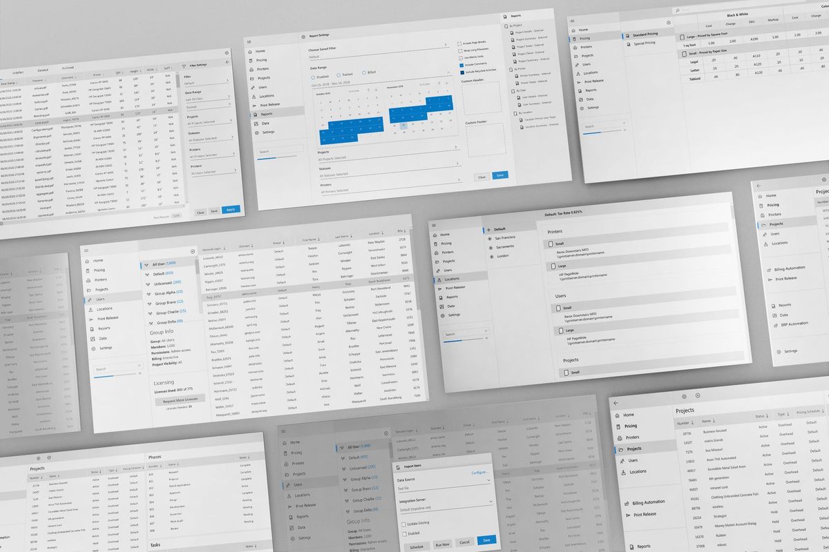
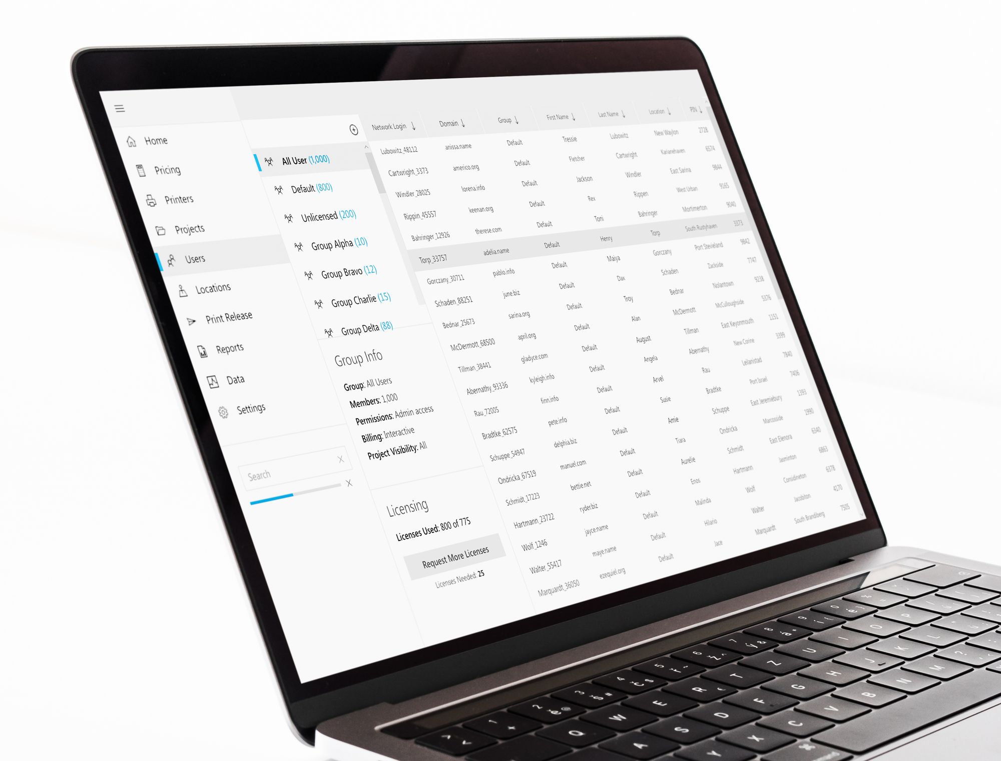
The UI of Argos had become outdated, and the software had developed some redundancies, inconsistent icons, and a lack of intuitiveness. Given the scale of change required, the redesign process was a daunting prospect. I recognized that the change could not be done incrementally and that users could be resistant to significant changes. It was therefore essential to ensure that the new UI remained intuitive for accounting users, while also providing IT users with a much better experience.
A Unique UI that Looks Very Familiar
To achieve this, I conducted a comprehensive examination of the visual vernacular used by Argos users to identify overlaps in patterns. This analysis revealed that users were already familiar with a range of software applications, including Windows, Android, MS Office, and, of course, Argos. Drawing on this insight, I borrowed approaches from all of these applications to create a new UI that looked completely different but still had a familiar organizational structure for users. By borrowing certain design principles from Material Design and following some of the basic structural rules introduced by Microsoft, I was able to completely transform the user experience with a unique design system that seamlessly fit into a Windows environment.
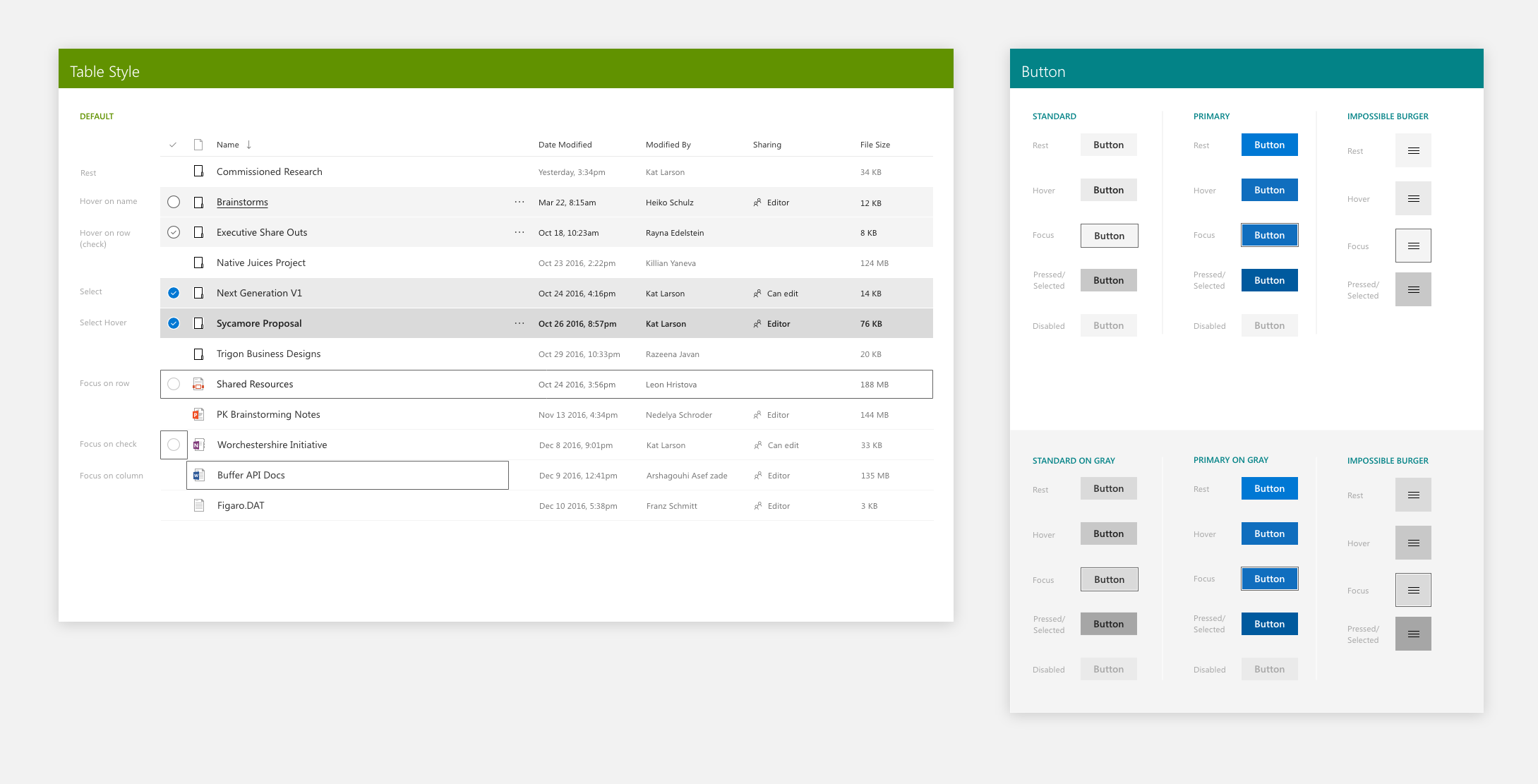
The Style Guide
The creation of a detailed style guide was integral to the UI redesign process. I emphasized my love for creating style guides, as it forced me to think beyond conceptual layouts and broad strokes. The level of detail involved in creating a style guide ensured that everyone, from designers to engineers, had a tool they could refer to when questions arose about the UI. This approach helped to maintain consistency throughout the design process, ensuring that the new UI remained intuitive and accessible for all users.
Conclusion
In conclusion, the redesign of Argos' UI highlights the importance of taking a nuanced approach to redesigning an established product. Throughout the process, I emphasized the need to recognize the resistance to change and adopt a self-aware persistence approach, which was critical to the successful redesign of Argos' UI. The redesign of the UI presented the challenge of creating a new look that was both unique and intuitive for all users. By conducting a comprehensive examination of the visual vernacular used by Argos users, I was able to create a new UI that looked completely different but still had a familiar organizational structure. Additionally, the creation of a detailed style guide was integral to maintaining consistency throughout the design process, ensuring that the new UI remained intuitive and accessible for all users.